
Titles & colour
Create readable titles, balance footage with colour corrections and refine source-backed TSX motion graphics with a delivery-focused review.
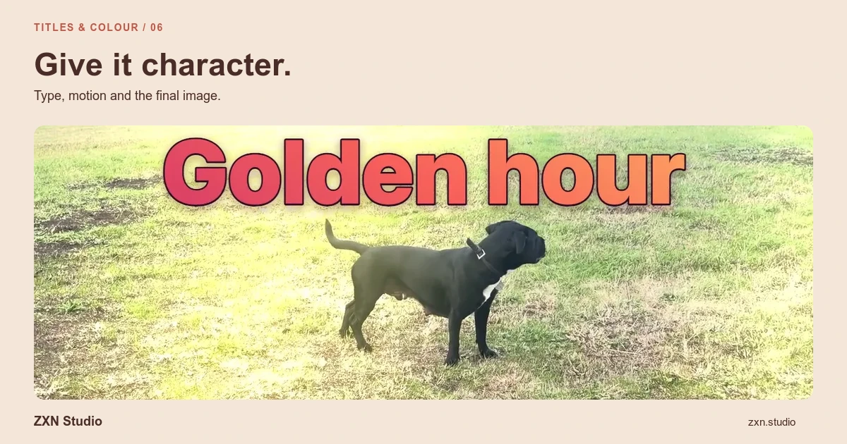
Titles should explain what the viewer needs to know, while colour work should make the footage coherent and readable. In ZXN Studio, begin with clear text and modest corrections before exploring elaborate title styles, filters or motion graphics. The editor includes colour corrections, wheels and curves, plus source-backed editable TSX motion graphics for work that needs more than a static label.
Treat text, motion and colour as related decisions: all three influence what the viewer notices first.
Write the title before choosing its style
Give each title one job. An opening title names the subject; a step label identifies an action; a lower-third can identify a speaker. Combining a headline, instruction and promotional message into one block usually leaves none of them enough room.
Write the shortest wording that remains specific. 'Change the export format' gives useful direction, whereas 'Next step' adds little when the interface is already changing.
Place the title over the footage and inspect the whole moment. Check that it does not obscure a button, a face or another label the viewer needs. The screen-recording article explains how to plan that visual hierarchy earlier.
Make readability a delivery test
Check text at the size the audience will actually see, not only in a large editor preview. Consider the smallest important screen and whether the surrounding interface competes with your wording.
Leave breathing room around text. Avoid placing it so close to an edge that a player interface or a different presentation context makes it awkward to read. Choose a text colour that stays distinguishable from the footage throughout the title's duration.
Read the title aloud while the section plays. If the text disappears before you can comfortably finish, shorten the wording or allow more time. An entrance animation should not consume most of the reading window.
Use animation to support the explanation
ZXN Studio supports keyframes and title styles, but movement needs a reason. A title can introduce a section or draw attention to a change; it does not need to move constantly while the viewer is reading.
Establish a clear start, a stable reading period and an unobtrusive exit. Preview the transition into the next shot so the outgoing title does not compete with a new instruction.
Free includes plain titles. Studio adds all title styles, alongside its broader effects and filters. Studio-only treatments can be previewed in Free, but their use is checked at export. Consult plan details before building a sequence around a restricted style.
Correct footage before applying a look
First identify the mismatch you want to solve. Is the camera image noticeably warmer than the surrounding material? Does one shot look much darker than the next? Are interface labels becoming harder to distinguish?
Use the available colour corrections to address those specific differences, comparing the treated shot with its neighbours. Keep a neutral reference in mind, such as a surface that should not carry a strong colour cast.
Avoid applying an aggressive look to an entire screen demonstration just to make the camera image more attractive. Product colours, charts and interface states may be part of the information you need to preserve.
Use wheels and curves deliberately
Colour wheels and curves provide more targeted control than choosing a finished filter alone. Use them when you can describe the change you need, then make a restrained adjustment and compare it against the uncorrected image.
For example, separating a dark subject from a dark background may require a different approach from reducing an overly bright area. Pushing contrast everywhere can make one part clearer while losing detail elsewhere.
Check several points in the clip after each adjustment. A correction that suits a still pose may behave poorly when the presenter moves closer to a light or a bright window enters the composition.
Keep motion graphics editable and testable
Source-backed TSX motion graphics let you work with the source behind a graphic rather than treating it only as a finished video. Keep related source material organised and make changes in small, reviewable steps.
After changing wording, timing or layout, inspect the graphic at its beginning, middle and end. Longer text can alter the balance of a composition even when the animation still runs.
Do not assume arbitrary third-party TSX projects or dependencies are compatible. Optional AI/Codex services may require separate accounts, downloads or charges; they are not a substitute for checking the resulting graphic.
Review the final combination
Export a representative test using your intended delivery settings. Examine text edges, colour consistency, timing and any Studio entitlement notices, then play the finished file outside the editor.
The useful stopping point is a video whose words are readable and whose footage feels coherent. Keep styling that clarifies the message and remove styling that competes with it.